
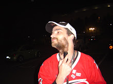
 Today, when the Sabres officially opened camp, they unveiled the new sweater. Although it was the worst kept secret in the history of poorly kept secrets, there were still some things that were unknown.
The picture here, of Danny Briere wearing the "road white" sweater was lifted from sabres.com. As you can see, the much maligned "slug" is indeed the primary logo. What was unknown, and isn't clear judging from this picture, is the secondary logo. It's believed to be a "B" with a single sword piercing it. Larry Quinn said back in July that the logo would feature "sabres". At the time, he didn't clarify whether he meant the word "SABRES", or swords. There aren't any words on the sweater, and the capital B with a single sword is a little more subdued than most people probably imagined. One picture I saw yesterday indicates that the secondary logo is tiny on the sweater.
The blue is in fact much deeper than I was guessing it would be. You can see that on Briere's sleeves, and on the player in the background donning the "home color" sweater.
We all know by now about the third sweater with the old school running buffalo and crossed swords. It has been suggested that the blue on the third sweater won't be as deep as that of the normal home sweater. When the third sweater is worn, the pants will look a little goofy because they won't match.
One unique feature of the sweater that I actually (kind of) like is that the player number is placed on the right side of the chest, opposite the "C" or "A" as well as on the sleeve. It seems a bit redundant, and the league doesn't actually require the numbers be on the sleeves at all (see Thrashers, Atlanta -- third sweater) I wonder if they'll stick with that, or remove one or the other set of numbers.
The only thing with those numbers being on the chest is that there would be no place to put a Stanley Cup Finals patch. I suppose they could put it somewhere on the sleeve. Obviously, I hope we don't find out the solution to that problem.
In all honesty, I have to admit that Quinn was right. The logo standing alone doesn't look that great, but on the sweater, it looks decent.
I'll know for sure on October 4, when the Sabres will be our guest for the Stanley Cup Champs banner raising party. Oh... By the way, opening night for the Canes sold out before tickets went on sale to the public.


5 comments:
I agree with you. I kinda like the numbers on the chest and the colors are better than I thought.
Good post.
I think the last major-pro team to put numbers there (or anywhere on the front, really) were the Chicago Cougars of the WHA. Before that, I can only recall the Boston Bruins doing it in the 30s and 40s. Certainly handy for checking assignments.
It's a horrid logo that loooks just as lame on a sweater as off (notwithstanding it looks nothing like a buffalo) & you're simply being too kind.
How am I supposed to mke fun of Carolina if you all go selling out games now?
Oh, don't worry — they'll drop back down to the usual 12,000 as soon as the Canes lose two in a row. :)
Post a Comment