A few days ago, I started what promises to be a very long process: tidying up this blog. First, I got rid of some dead wood in the blogroll. Then I added a couple of blogs to the roll.
I asked for some help with getting a better looking banner for the blog, and I got a few emails about that with some pretty good designs. Thanks to everyone who sent me one.
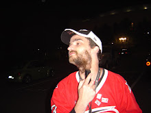
I felt like I would be a chump if I didn't incorporate the "Canes girl" that my friend Rob sent me. In all his modesty, he said he put it together in just a few seconds. Anyway, I experimented with a few different ways to work the girl into a logo/banner, and I just got tired. And frustrated. So I went with simplicity. Thanks again to Rob for the picture.
Thanks also to the others who sent me their designs. They may be used at some point.
Still to come, an overhaul of the whole template.
I should also mention again that this blog is designed to be viewed using the Mozilla Firefox browser. Seriously. It looks better. And Mozilla is a better browser.
As always, advice/commentary/criticism is welcome
A Carolina Hurricanes blog with occasional news about the rest of the NHL.
Thursday, May 29, 2008
Subscribe to:
Post Comments (Atom)
disclaimer
Red And Black Hockey is not affiliated with or endorsed by the Carolina Hurricanes Hockey Club, the National Hockey League or any of its other member clubs. The opinions expressed herein are entirely those of RBH. Any comments made are the opinion of the commenter, and not necessarily that of RBH.
Whenever possible, RBH uses its own photography. Any incidental use of copyrighted material including photography, logos or other brand markings will not interfere with the owner's profits.
Whenever possible, RBH uses its own photography. Any incidental use of copyrighted material including photography, logos or other brand markings will not interfere with the owner's profits.


3 comments:
This is a nit-pick, and I don't know if there's anything you can do about it, but at the top of the page there's a stylesheet declaration that appears just before the blogger search bar appears. Image
The problem is you close the style tag twice (i.e. two </style> tags). If you remove the first one, the problem should be fixed.
Thanks, Mike. I fixed it. That was actually driving me crazy.
I'm bored with my blog layout, but I'm not thrilled with the selection of blogger templates and I haven't learned how to code my own layout yet. *sigh*
I also haven't wanted to take down the black yet. Still in mourning.
Post a Comment